Tag Archives: 3 to 4 Ounces

Design Time: Senior #1

Page design by Julie Huggins.

Page design by Julie Huggins.

This is one of my favorite pages from the newest edition of 3 to 4 Ounces. I think it’s pretty clean cut and your eyes flow down the page; plus, I really like the blue color. (I came to find out after it was released this is pretty much his favorite color, so I think I did well.) With a full spread, I might have been able to make the page more visually interesting, but really I wanted to focus on the guy and his answers, not how fancy the page design is.

But I guess that is a sign of good page design, that is can be intricate and detailed and the viewer just takes it all in. Maybe I’ll reach that one day.

Leave a comment

June 24, 2014 · 5:07 pm

Design Time: Proust Questionnaire

Page 14-Proust Questionairre

Layout and graphics by Julie Huggins.

Every semester, 3 to 4 Ounces asks three seniors to answer questions from the Proust questionnaire. I wish I had been more careful about outlining the image so all of the lines would touch, but I still think it turned out well.

Leave a comment

June 10, 2014 · 10:42 pm

Design Time: Title Page

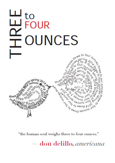
3 to 4 Ounces

I feel kind of strange posting these here, but oh well. This is my blog, and I want to show my whole person, not just what I write. I designed this title page for the spring 2014 edition of 3 to 4 Ounces, Wake Forest University’s student literary magazine. I like it, even though it’s not exactly gorgeous.

Part of an on-going series, where I put up anything I’ve ever done and hope people like it.

Leave a comment

June 5, 2014 · 8:16 pm